Why I keep a physical portfolio (and why you should too!)
Being an artist in this digital age is nothing short of amazing. I can send photos to galleries and customers across the world in the blink of an eye, swap stories and ideas with artists I’ve never met, have a image gallery of my current work accessible at a moments notice, and sell my work via a small metal box filled with chips and screws. Maintaining a digital presence has been an integral tool in my art practice, and being online has opened so many doors for my work.
But not everything is online.
It’s important to have some physical records of our work too. Things we can hold in our hands, share tangibly, and have a real face-to-face conversations over.
One of these things is my actual, printed, physical portfolio.
Why I Use a Portfolio (instead of pulling up my website)
The experience: I like books. I love my kindle and do *most* of my reading digitally nowadays - but certain, special books demand a physical copy. I can’t read Tolkien on a screen. Flipping through actual pages, holding the object in my hands is a different level of interaction and it gets stored slightly differently in my memory. This translates to using a physical portfolio - I can share it with customers, refer to it during gallery meetings, pull it out for open studio nights, have it on a table during art shows, and yes it’s more-or-less the same thing as having a screen up with my website - but a book is experienced differently.
It allows the viewer to flip through it at their own pace, no digital navigation to contend with and lets them have a more personal interaction with my work.
For my records: I exist in a constant state of organized chaos. My studio is *usually* a mess, but I know where everything is. My work is spread out around the house, a storage unit, galleries and venues, and in private collections. I have a mental list of where some of my favorite pieces now live, but it can get muddy with new collections and new shows. My website changes and updates frequently enough that keeping a dedicated “favorites” corner doesn’t really make sense - even if it’s just for my own records. Enter, my portfolio. In addition to being a book that showcases my best work, it also serves as a physical collection of some of my favorites. When i finish a painting that I feel is particularly strong, or answers a question that’s been hounding me for awhile - I photograph it, print it and load it into the portfolio. Depending on page count I’ll either replace something older, or add a new page. What results is a book that I am proud of, that serves as a reference for me personally.
How I made my Portfolio:
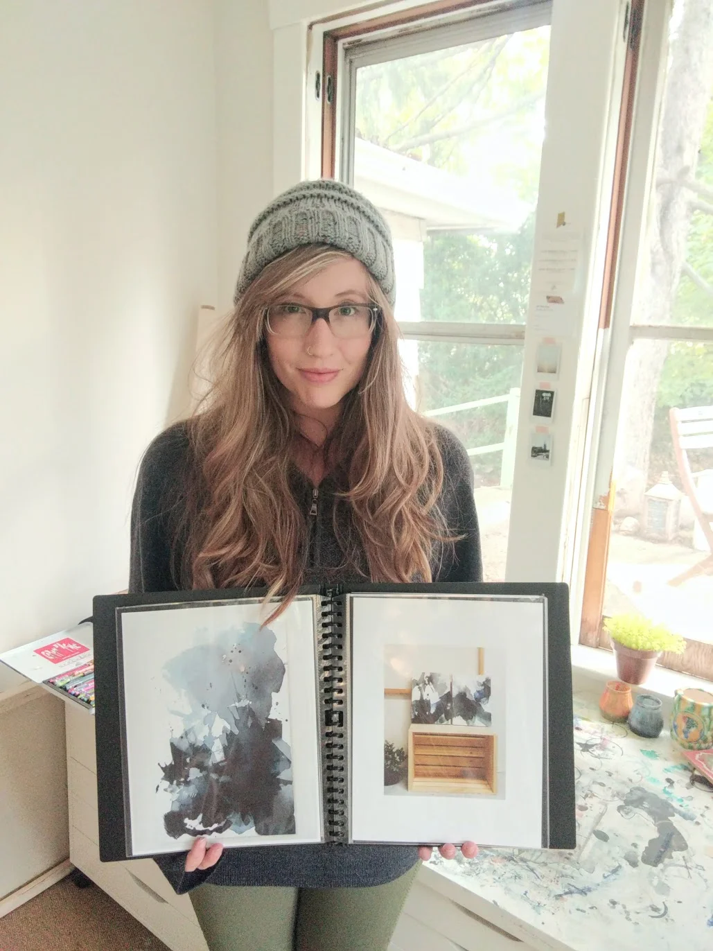
I debated about getting one printed and professionally bound and all that fancy jazz - but realized I change and update it too frequently for that to be a financially sound choice. So I picked out a slim, black classy binder with tight spiral binding and nice shiny page covers. For each page I added a sheet of black card stock, one to add some thickness to the page and two for giving each printed image a black border.
I printed my images on thick, semi-gloss paper and then laid them out on the table to select an order. I followed the rule of best images first and last, with favorites and notable projects making up the middle section. I tried to find a pleasing flow of movement and color - something that would be interesting to flip through. (To see a video of the flipping through head over to my IGTV!)
Tips to make your own:
Gather your images! Once you have a good collection of 15 - 20ish, find a trusted friend or mentor to help you narrow then down. For books like these (designed to be a summary of work) I like to keep it at 12-14ish - not so many images that it’s overwhelming, but enough to give a good idea of my work.
Pick your form factor. I went with an 8.5 x 11 book, though I almost picked an 11 x 17. In the end, I decided to go a little smaller for portability - but I love the look of the bigger books.
Gather your materials! Get your images printed, or purchase the paper to print yourself. I don’t use super fancy paper for this, just something that looks professional, reproduces the colors well and is relatively thick. Archivability isn’t a huge concern here, this is just an overview of my work - nothing I’m going to turn around and sell.
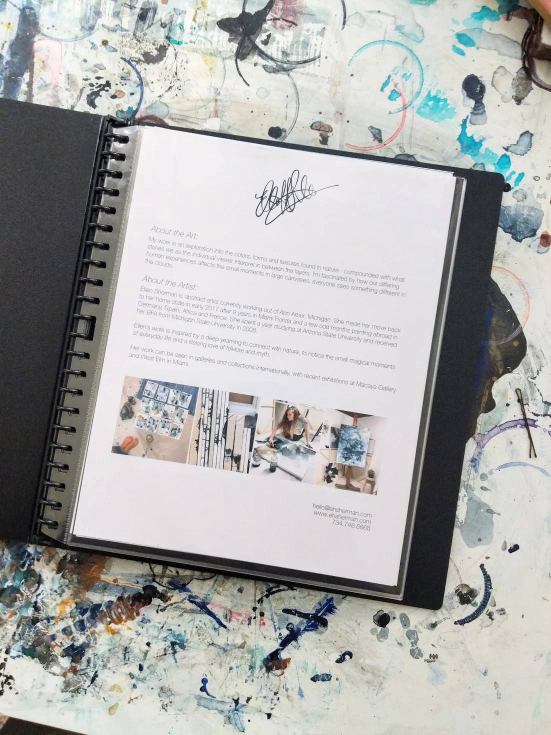
Make a cover page! Use this as an introduction to you as the artist and your work. Think of the book on a table at an art show by your paintings, but you’re talking to a guest across the room. What do you want them to know? I include a bit on my process, my statement and my contact information. It speaks for me when I can’t.
Consider a price page! At the very end of the book I have a page with titles, sizes, mediums, availability and depending on the event - prices. Sometimes I leave the prices out, sometimes I add them in - just depending on where I’m at.
Do you keep a portfolio already? How do you use yours in your practice? Also if you have any tips for artists just starting theirs I’d love to read them!


